
Bronze is an alloy of copper and tin. That alloy generates an orange color immediately but with the contact of air or moisture produces a change in its color, called patina, which is really a reaction to protect the metal itself. For a long time it was used and is still used in the decoration of the environments both in its bright and patina state. But we wonder how to use bronze color?
The first recorded use of bronze as a color name in English was in 1753. From there the industry has increased its use in many ways.
Bronze Color Psychology
The bronze color belongs to the brown family, which is an abundant color in nature and is associated with maturity and earthiness. Like the browns, it is a warm color, it is a very popular color for the spaces we live in. It creates an ideal climate in the rooms being one of the colors of warmth. And that warm atmosphere allows you to have a better disposition towards everything you want to do.
The bronze color projects wealth and refers to strength, growth, and experience.
Bronze Color Code
The bronze color consists of 80.4% red, 49.8% green and 19.6% blue.
In RVB the code is 205,127.50
In hexadecimal the code is # CD7F32
Bronze Color in Interior Decoration
Unlike brown, bronze is a metallic color and would be annoying to look at if we paint the walls of an environment. The same would happen if we fill with decorative bronze objects, it is like it becomes invasive to the vision. However, the decoration with bronze is high in exclusive designs.
In kitchens and bathrooms, it is used as a decorative finish for various objects and appliances, such as appliances or parts such as faucets, pipes, and handles. In addition to giving a special touch to metal utensils, it also works in parts of the kitchen such as drawers, shelves, and doors.
Bronze Color Variations
Dark bronze
The dark bronze color with hexadecimal color code # 804a00 is a medium-dark brown shade. In the RGB # 804a00 color model it is composed of 50.2% red, 29.02% green and 0% blue. In the color space HSL # 804a00 has a hue of 35 ° (degrees), 100% saturation and 25% brightness.
Brilliant Bronze
It is a light bronze color with predominant shine. It is usually considered as a metallic bronze.
Reddish Bronze
This hue is characterized by being a medium brown with reddish hues.
Bronze Earth
It is known as a bronze with a dark brown inclination, very similar to the color of the fertilizer.
You may also like…

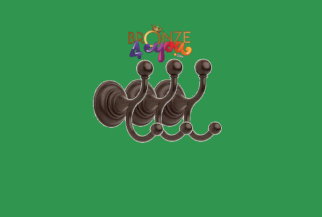
BRONZE TOWEL HOOK 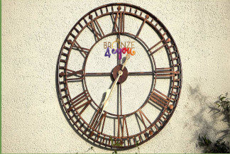
BRONZE CLOCK 
BRONZE BAR
Bronze Color and Fashion
Metals took our feet, but will not prevent us from walking because of their weight. Metallic shoes have colors like bronze and it is certainly a trend that will make us shine.
While these shoes exist in flat versions or with heels, those with low heels are more casual. They look great with jeans. It is that one would tend to think that metallic shoes are rather for the night because of the brightness. But well combined makes them for every day.
Also, bronze shoes look good both in winter and summer. Stop thinking that colors and brightness are exclusive to the holidays. In winter we fill up with black and gray in the streets. But in reality, it is the ideal time to bring color and shine Do not be afraid to go out with your bronze-colored shoes even if all the rest have forgotten that we humans see in colors all year long!
Bronze shoes come in all shapes, sneakers, heels, sandals, or ankle boots, the options are many. And in summer you can wear them with shorts, skirts or dresses, just combine them.
When choosing clothes, the low profile is what will give prominence to shoes. Therefore, to give prominence to shoes Metallic let them shine without the rest of the look dulling them. Pastel colors also look good, as the “low revolutions” pastel and shoes the rise, creating a balance.
Color and Marketing
When we talk about the psychology of colors we mean a field in which the effect of colors on human perception and behavior is analyzed.
Colors are everywhere, and in everything we do. So much so that our emotions and feelings are conditioned by the colors we perceive.
The reaction to colors is a series of primitive responses that have been studied over time. And like everything that affects our emotions and, consequently, our habits and behaviors, both at the level of relationship and purchase, it is used in marketing to influence these decisions.
The definition of “marketing” is a set of techniques and studies that aim to improve the marketing of a product. Within the set of these many techniques, we find the use of color.
The meaning of the colors can vary from one person to another, as other factors influence the mood, culture, previous experiences and the ability or the moment and the place where you are.
For example, note the color White:
It represents cleanliness, purity, serenity, softness, simplicity … This color is used, for example, in fields such as medicine, fashion or nature.
But if you look, few people name it as their favorite color and a few others who consider it a color that they can’t stand.
There are also several debates about whether the color white can be considered a color. What we do know is that it transmits things to us in the same way as the rest of the colors.
Bronze Color and Marketing
Now let’s analyze the Bronze Color:
This color may be related to the skin or something organic. It can also emanate the feeling of stability and reliability. For those who have a skin clinic, it may be beneficial to incorporate this shade into your company logo.
However, some people may consider this color boring and simple. Others will choose as an alternative to black. You can send a feeling of warmth to your customers.
Since it can also refer to honesty and reliability, real estate companies are also introducing the bronze color in their logo.
It is important to know very well the public to whom we want to direct our product, our propaganda or the image of our company that we want to convey with our logo. You should also think about how this color can influence your target audience.
If you are thinking of using this in your commercial application, you should carefully understand the message you are trying to convey.
Bronze is related to something practical and healthy, but at the same time, some people consider it boring and predictable.
By learning about the meaning of bronze, you can understand how to incorporate this into different aspects of your business.